Colors
Colors for the C2C UIKits.
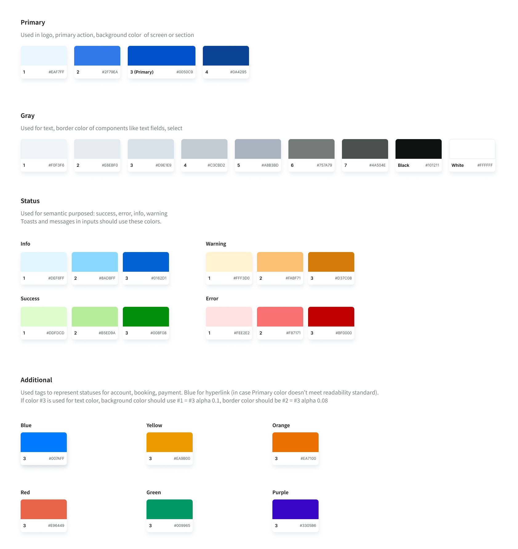
C2CColorThemeData
Primary Colors
primary1primary2primary3primary4
Gray Colors
gray1gray2gray3gray4gray5gray6gray7blackwhite
Success Colors
success1success2success3
Error Colors
error1error2error3
Info Colors
info1info2info3
Warning Colors
warning1warning2warning3
Additional Colors
additionalBlueadditionalYellowadditionalOrangeadditionalRedadditionalGreenadditionalPurple
Accessing the Color Theme
You can access the color theme data using C2CTheme.of(context) or C2CColorTheme.of(context) method within your widgets.
Example Usage
Widget build(BuildContext context) {
  final colors = C2CColorTheme.of(context);
  return Container(color: colors.primary3);
}

// or

Widget build(BuildContext context) {
  final c2cTheme = C2CTheme.of(context);
  return Container(color: colors.primary3);
}
Apply a default text style to its descendant widgets
C2CColorTheme(
  data: const C2CColorThemeData(
    primary3: Colors.red
  ),
  child: Builder(builder: (context) {
    return Container(color: colors.primary3);
  }),
)